Flex-Layout-Project
Flex Layout Project
Table of contents
Overview
A responsive Flexbox layout project demonstrating multi-section flexible grids, alignment, and responsive breakpoints.
The challenge
Users should be able to:
Build a responsive layout using HTML and CSS Flexbox.
Adjust layout across breakpoints:
Default large screens
Max-width 760px
Max-width 320px
Ensure all divs center their content using Flexbox alignment.
Maintain consistent spacing and alignment across containers using gap, flex-basis, and flex-wrap.
Screenshot
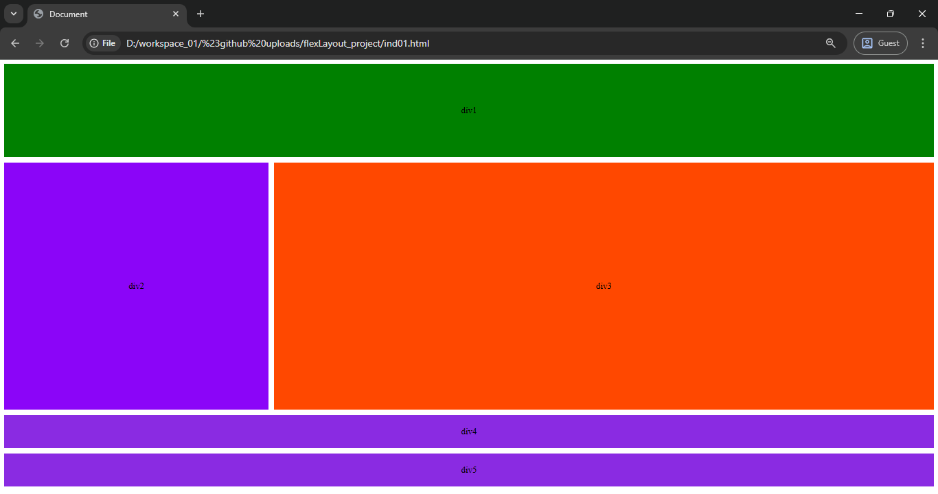
Image.png
Built with
-
HTML5
-
CSS3 (Flexbox)
-
Mobile-first responsive design practices
Author
- Frontend Mentor - [@shrikanth-dev]
- LinkedIn - @G Srikanth